
In broad terms, there are two basic types of fonts out there, the serif and the sans serif. If you aren’t a typographer or graphic designer, chances are you will have no idea which you are looking at or even what a serif is. This article will give you a brief understanding of what a serif is and how to identify it.
Historical Roots of Writing
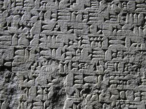 As you might guess, our printed and computer fonts have historical origins that pre-date the printing press and computer. It is believe that the earliest forms of writing go back to Akkadian clay tablets (3200 BC) and Egyptian hieroglyph stone tablets (Narmer Pallet from 3100 BC). Historians debate which actually came first. However, for the purposes of this article, lets look at Akkadian clay tablets. The most famous document written in Akkadian is the Hammurabi Code which is believe to be the worlds first legal document. Akkadian is the grandparent of Hebrew. In terms of development we have Akkadian, followed by Sumerian, and then Hebrew. Akkadian and Sumerian are both written in a unique style of writing called Cuneiform. This is where the serif begins to make its appearance. Notice that each looks like a wedge with a wide end moving to a narrow point. It is believe that each of these figures was made by taking a wood stylus pressed end first into wet clay. The clay was then baked so it would become hardened. The wider end of the stylus creates the wide end of each insertion. This wider edge may very well be where the serif first began.
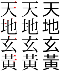 Once writing began to be written using brushes with paint or ink, similar writing styles were found to emerge in Chinese characters. In the Chinese text to the left we see small ends of brush strokes where the type is thicker than the thinner stroke portion which is very similar to what we see in both Akkadian and Sumerian Cuneiform.