
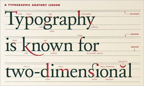
There are a few basic terms that we use when we start talking about typesetting which will be helpful for clients to be aware of when dealing with graphic designers. I’ve listed a few of the more common terms below along with a short description of each.
Kerning
You may have heard this term before, but not quite sure what it means. That’s ok! It is sort of easy once you wrap your mind around it. Kerning is the distance between two letters. Some letters ‘tuck’ together closer than others. For instance, the Letter ‘T’ followed by a small letter can be tucked close together. Another example might be a capital ‘W’ followed by a capital ‘A’. Because of the angled sides of each, they can be kerned tightly together. How tight or loose the kerning settings are depends on the eye of the typographer or designer.
Tracking
If kerning is the space between two letters, then tracking could be best defined as the spacing between an entire group of letters–typically an entire line or paragraph. Tracking is often confused with kerning because both deal with letter spacing. However, once you understand that kerning deals specifically with a single pair of letters and tracking deals with an entire set, the difference becomes clear.
Leading
The term leading actually comes from lead spacers used by typographers back in the days before computers. It deals with the space between two lines of text. By default computers use a rule of 120% leading between two lines. For instance, if you have 10 point type (the height of letters are typically measured in points), then the auto setting for leading would be 10 x 120% = 12 points. So this would give you about 20% of the height of a letter between two lines of text. This 120% figure is based on your line of type having about 8 – 12 words per line. If you go much over this line length, the human eye and brain have a hard time finding the beginning of the next line and the leading should be increased. Of course there are exceptions to this rule of thumb for formal documents, logos, slogans and poetry. But, for the majority of lengthy document the rule is followed.
Baseline Shift
If we move one or more letters vertically up or down away from the default line, this is called a baseline shift. There are various reasons for doing this and often the type that is moved off the baseline is also reduced in size. Examples might be a superscript or subscript. A footnote notation might be done in a superscript where the number 12 is shifted up and reduced in size. Mathematical formulas often have superscripts or subscripts for square roots and such. Leading should be changed for large paragraphs of text and a baseline shift used for a single line or more often individual letters or groups of letters.
Hopefully this brief typography guide has been helpful in explaining several common terms used by designers and typographers. Next time you are working with a designer you can compliment him on his excellent kerning skills!